What Are Complementary Colors? A Comprehensive Guide
Complementary colors are an essential concept in color theory, widely used in design, art, fashion, and even marketing. These pairs of colors, when placed next to each other, create striking visual contrast and make each other appear more vibrant. Understanding complementary colors can significantly improve the effectiveness of your work, whether you’re designing a website, creating art, or selecting color schemes for your brand. In this article, we’ll explore the meaning of complementary colors, how they work, and how to use them effectively in various applications.
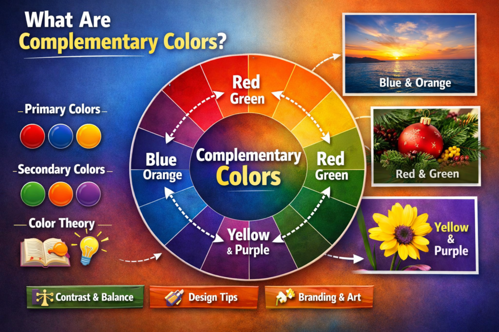
What Are Complementary Colors?
In simple terms, complementary colors are colors that are opposite each other on the color wheel. When placed side by side, they create a high contrast, vibrant look. The concept of complementary colors is deeply rooted in color theory, which explains how different colors interact with each other.
The Color Wheel: The Foundation of Complementary Colors
The color wheel is a circular diagram representing different hues arranged by their chromatic relationship. In addition, it consists of primary, secondary, and tertiary colors. Complementary colors are always located directly across from each other on the wheel.
-
Primary Colors: Red, blue, and yellow. To learn more about primary colors, check out our article on What Are The 3 Primary Colors?
-
Secondary Colors: Green, orange, and purple (formed by mixing primary colors).
-
Tertiary Colors: A mix of primary and secondary colors, such as red-orange or yellow-green.
The complementary color pairs are formed by combining one primary color with a secondary color created by mixing the other two primary colors. For example:
-
Red and Green: Green is created by mixing blue and yellow, making it complementary to red.
-
Blue and Orange: Orange is formed by mixing red and yellow, making it complementary to blue.
-
Yellow and Purple: Purple is made by mixing red and blue, making it complementary to yellow.
Why Are Complementary Colors Important?
Understanding complementary colors is crucial because they help create visual interest, contrast, and harmony in various forms of creative work. Whether you’re designing a logo, decorating a space, or developing a website, complementary colors can:
-
Enhance Visual Appeal: The strong contrast between complementary colors grabs attention and makes designs more visually appealing.
-
Create Balance: Properly using complementary colors can help balance the visual weight in a composition.
-
Evoke Emotions: Colors have the power to influence emotions, and complementary colors can create specific moods or feelings.
-
Improve Readability: Complementary colors can be used to highlight text or important elements on a page, improving readability.
How Do Complementary Colors Work?
Complementary colors create a high contrast and intense look when placed side by side. This contrast makes each color appear more vivid and striking. Here’s why this happens:
-
Optical Illusion: When complementary colors are placed next to each other, they cause an optical illusion where the colors seem more vibrant. This is due to the way our eyes perceive color contrasts.
-
Simultaneous Contrast: This optical effect occurs when one color is seen against its complementary color. The complementary color makes the first color appear more intense.
How to Use Complementary Colors in Design
While complementary colors create a dynamic effect, it’s important to use them carefully. When overused, they can be jarring to the eye. Here are some practical tips for incorporating complementary colors effectively in your designs:
1. Use Complementary Colors for Accents
Instead of using complementary colors in large quantities, use them as accents to highlight key elements. For example, a red button on a green background will draw attention and encourage clicks. This technique is commonly used in web design, advertising, and branding.
2. Create Contrast with Text
Complementary colors work wonders when you need to create contrast between text and background. For instance, using a yellow background with purple text creates a bold and readable design. This approach is commonly used in posters, signage, and digital media.
3. Apply Complementary Colors in Small Areas
To avoid overwhelming your audience, use complementary colors in smaller amounts. For example, a room painted primarily in neutral colors can be complemented with green plants or purple throw pillows to add life to the space without clashing.
4. Use Muted Tones for a Softer Effect
If you want a more subtle effect, opt for muted complementary colors. For instance, instead of using bright red and green, you could choose a softer, pastel red with a sage green. This allows you to retain the complementary effect while maintaining a calmer visual impact.
5. Incorporate Complementary Colors in Photography
Photographers often use complementary colors to enhance their images. For example, a photographer might position a subject against a background that includes complementary colors to make the subject stand out more. This technique helps in portrait photography, nature shots, and even product photography.
Examples of Complementary Color Pairs in Everyday Life
Complementary colors are not just confined to design and art; they can also be found all around us in nature, fashion, and branding. Here are some examples:
-
Red and Green: Christmas decorations often use this complementary color pair, creating a festive and eye-catching aesthetic.
-
Blue and Orange: A sunset, with its orange sky and blue ocean, beautifully showcases this complementary color combination.
-
Yellow and Purple: The vibrant yellow of a sunflower paired with the purple background creates a bold, striking look in nature.
-
Black and White: While not on the color wheel, black and white are often used as complementary contrasts in design and photography.
Complementary Colors in Color Schemes
When creating color schemes for various projects, you can use complementary colors to enhance the overall composition. Here are a few types of color schemes that use complementary colors effectively:
1. Complementary Color Scheme
This is the most straightforward use of complementary colors. It uses two colors from opposite sides of the color wheel. This scheme creates a vibrant look with high contrast but can be overwhelming if used too much. It’s best to balance it with neutral colors.
2. Split-Complementary Scheme
A split-complementary scheme involves one base color and the two colors adjacent to its complementary color. This variation offers a more balanced look while maintaining the contrast of complementary colors. For example, blue as the base color with yellow-orange and red-orange as its complementary colors.
3. Triadic Color Scheme
The triadic color scheme uses three colors that are evenly spaced around the color wheel. It includes two complementary pairs. For example, using red, blue, and yellow together creates a harmonious yet dynamic effect. This color scheme is commonly used in illustrations, artwork, and logos.
The Psychological Impact of Complementary Colors
Colors have psychological effects on people, and complementary colors are no exception. However, here are some of the emotional and psychological responses that can be triggered by complementary color combinations:
-
Red and Green: Often associated with Christmas, this combination evokes feelings of warmth, celebration, and joy.
-
Blue and Orange: The contrast between these colors can create excitement and energy. It’s often used in sports teams and advertisements to grab attention.
-
Yellow and Purple: This combination conveys creativity, luxury, and sophistication, often used in branding for high-end products.
-
Black and White: The timeless contrast between black and white evokes a sense of balance, simplicity, and elegance.
Complementary Colors in Marketing and Branding
Brands use complementary colors strategically to influence how their products or services are perceived. For example:
-
Coca-Cola uses red and green in its holiday campaigns to evoke feelings of warmth and celebration.
-
Pepsi uses blue and red to create a sense of trust and excitement.
-
Taco Bell incorporates purple and yellow to create a sense of fun and creativity.
By understanding how complementary colors work, businesses can create more effective marketing materials, color schemes, and logos that resonate with their target audience.
Conclusion
Complementary colors are a powerful tool in design, art, and marketing. They create contrast, make visuals more engaging, and help evoke specific emotions. Whether you’re designing a website, creating a painting, or branding a product, understanding how to use complementary colors effectively can significantly enhance the appeal and effectiveness of your work.
By following the tips and guidelines shared in this article, you can create visually dynamic and harmonious designs. Experiment with complementary color combinations in your projects, and don’t be afraid to play with the intensity, tone, and placement of colors for the best impact.